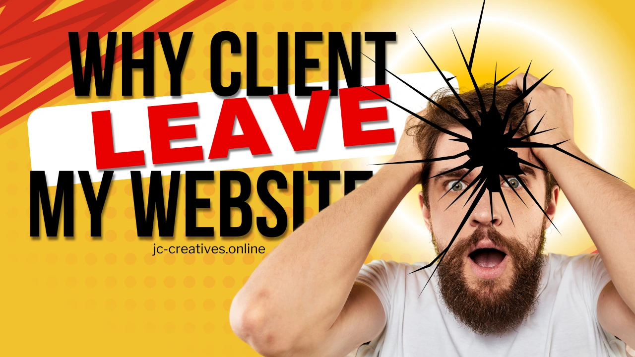

WHY CLIENT ALWAYS LEAVE MY WEBSITE?
Creating a website that keeps your visitors engaged and converts them into loyal customers is no easy feat. Many website owners and designers invest time and resources into making their sites visually appealing and content-rich, yet still face high bounce rates and low engagement. If you’ve found yourself wondering why potential clients are leaving your site, the answer might lie in three common mistakes that turn visitors off.
Too Much Design. When Visuals Overwhelm the Experience
One of the main reasons clients leave a website is having too much design. A visually appealing website is essential, but going overboard with elements like animations, pop-ups, and flashy effects can backfire. Instead of enhancing the user experience, too many visual distractions can confuse and frustrate visitors. They may struggle to find what they’re looking for, or worse, feel overwhelmed by the clutter. Over-designing happens when we prioritize aesthetics over usability.
Too many animations, hover effects, and transitions can cause sensory overload, leading to a poor user experience. What seems like a minor design tweak to you might be a major annoyance to your visitor. To fix this, it’s best to simplify your design and use animations and effects sparingly. The goal is to make your message clear and your website easy to navigate. User testing can be helpful here—ask a few people to browse through your site and see if they find it distracting or are struggling to find information. Remember, good design is about balance, and when it comes to keeping users engaged, less is often more.
Slow Website
Another major issue is having a slow website. A slow-loading website is one of the quickest ways to lose a potential customer. People expect pages to load almost instantly, and if your site takes more than 2 seconds to load, visitors may get impatient. If it takes more than 5 seconds, they’re likely to hit the back button and move on to a competitor’s site. Slow load times can be caused by several factors, including unoptimized images, excessive scripts, bulky design elements, or poor server performance. A slow site not only frustrates users but also negatively impacts your SEO ranking, making it harder for potential customers to find you.
To improve your site’s speed, consider optimizing images by using compressed images and choosing the right file formats, such as JPEG for photos and PNG for graphics. Minimizing plugins and scripts is also crucial—excessive third-party scripts can bloat your site. It’s a good idea to leverage browser caching, which stores resources locally on a user’s device, reducing load times on repeat visits. Using a Content Delivery Network (CDN) can help speed up load times as well by serving your site’s resources from a network of global servers. It’s essential to focus on your hero section, the main area of your homepage. According to the 3-second rule, visitors make a judgment about your site within 3 seconds of seeing the hero section. If it’s slow to load, poorly designed, or irrelevant, they’re more likely to leave.
Dead Hero Section. When First Impressions Fall Flat
desc3: The third and final reason is having a dead hero section. The hero section is the first thing visitors see when they land on your homepage. If it’s not engaging, your chances of keeping them drop significantly. A dead hero section is one that fails to captivate visitors, either because it’s too generic, lacks a compelling message, or simply doesn’t relate to the audience’s needs. Many websites opt for a beautiful background image or slider but neglect to include a clear headline or call to action. Without a strong hook, visitors don’t see why they should stay, and your bounce rate spikes. To fix this, focus on a clear value proposition.
Your hero section should instantly communicate what your business does and why it matters. Adding a strong call to action like “Get Started,” “Learn More,” or “Contact Us” can guide visitors on what to do next. High-quality images are important too, but choose ones that support your brand message without overwhelming the main content. You should also test your messaging by experimenting with different headlines and subheadings to see which resonates most with your audience. Think of your hero section as the storefront of your business—it should be inviting, clear, and immediately show visitors that they’re in the right place.
Conclusion
If your website is struggling to retain visitors, chances are it’s due to one or more of these mistakes. Whether it’s overwhelming design, slow load times, or a weak hero section, the common theme is user experience. Always put yourself in the shoes of your visitors and think about what would make their journey through your site smooth and engaging. By simplifying your design, optimizing your website speed, and creating a compelling hero section, you’ll not only keep visitors on your site longer but also convert them into loyal clients. So, take a step back, analyze your site, and make the necessary changes. After all, a great user experience is the key to turning visitors into customers.